Overall I think this animation is really well put together and is now one of my favourite animations.
Tuesday, 29 October 2013
Sorry I'm Late- Tomas Mankovsky
Overall I think this animation is really well put together and is now one of my favourite animations.
Lost Things
Set, Series, Sequence Development.
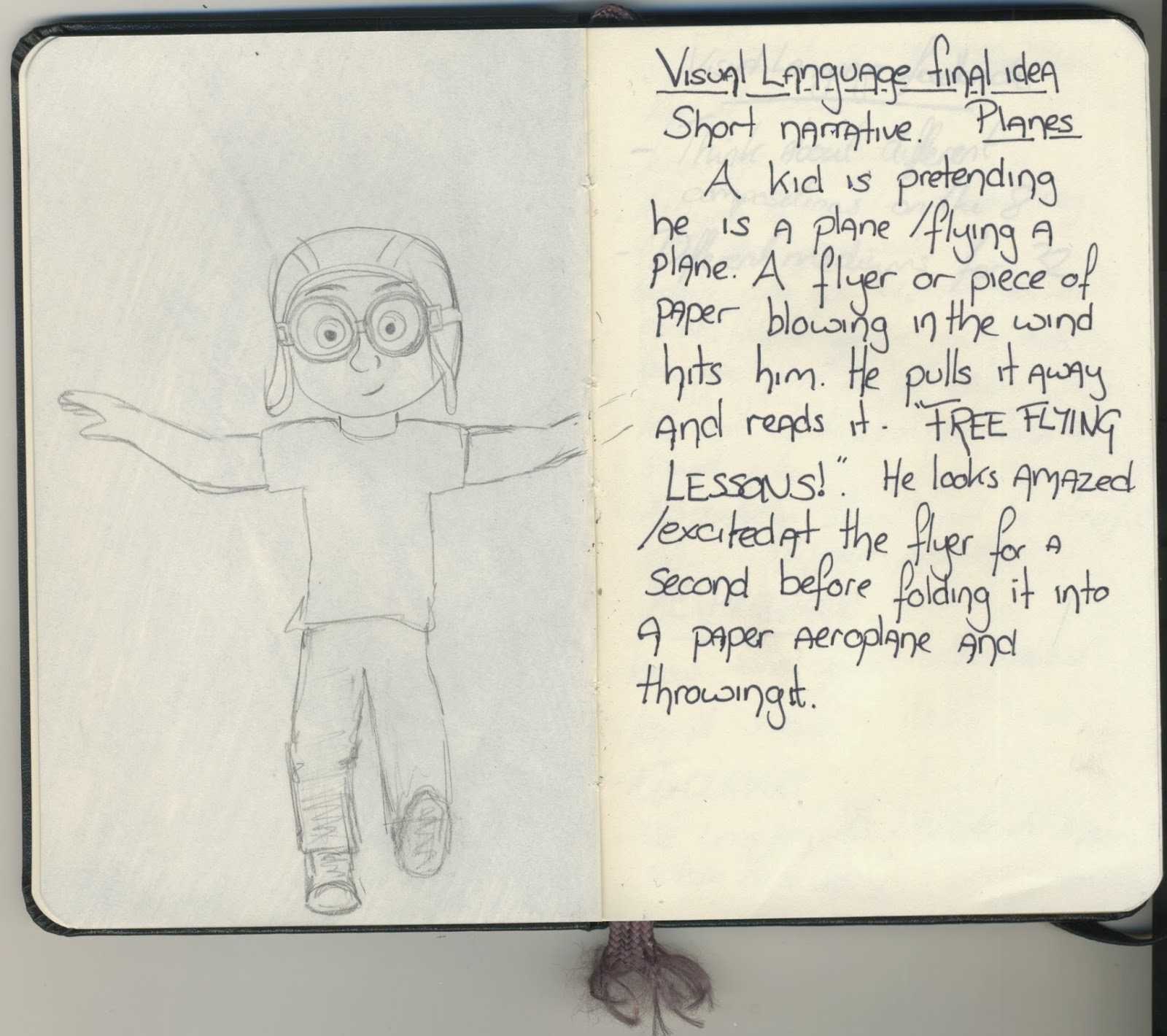
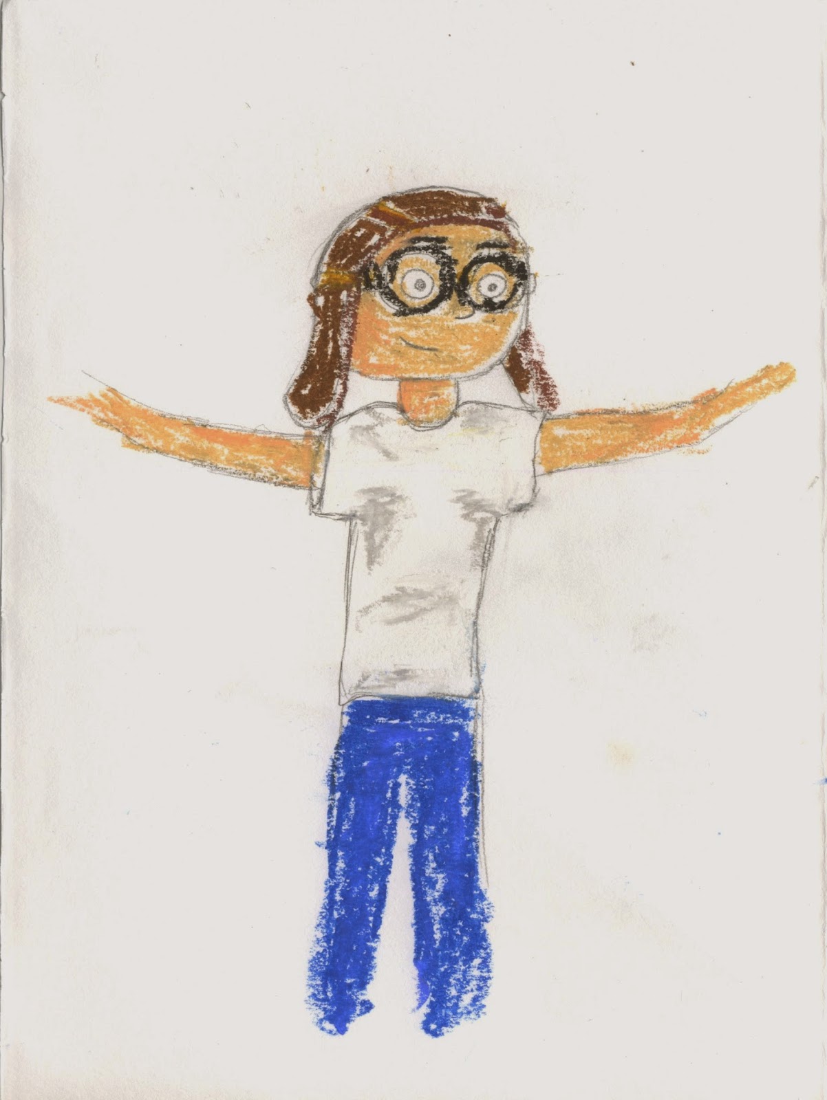
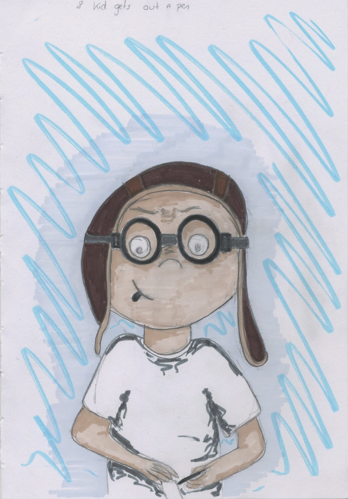
My word for Set, Series, Sequence was plane. I started by drawing my 32 images to do with plane. My favourites were the kid playing that he was a plane (Like the carl from Up) and the paper plane. I then took these to my 8 drawings, looking at viewpoints and media.

I made some notes in my sketchbook when I thought of ideas to draw..
And finally I came up with my final idea for my sequence of 12.
Monday, 28 October 2013
Her Morning Elegance- Oren Lavie
Sunday, 27 October 2013
Photography induction
Our Photography induction helped me learn how to use the DSLR camera's and also taught me about white balance and lighting.

I learnt that if there was not enough exposure, the image was too dark.

Then I adjusted the exposure, but I adjusted it too much and the image was too bright.

Finally, I got the exposure right and got a good, well lit picture.

Adjusting the white balance- When it is set to Fluorescent lighting the image comes out with a yellowish tint.

When the white balance was set to Tungsten lighting, the image comes out whiter and more balanced.

You can also use a light reflecting disc to evenly distribute the light to reduce shadows.

Friday, 25 October 2013
Pose to Pose Animation
Thursday, 24 October 2013
Luminaris
Full video here: http://vimeo.com/24051768
I found this video on Short of the week a few days ago and completely fell in love with it. I love the story in it and the idea of how these lightbulbs are made. The story is so well designed that you fall in love with the characters in the 5 minutes that the video plays for.
As an example of pixilation, it is so well put together and skillfully done, the people literally glide across the floor.
Tuesday, 22 October 2013
Ten Thousand Pictures of You
This video by Robin King, uses pixilation to tell a story of heartbreak in a fairly comical way. Pixilation (stop motion with people) often makes serious or upsetting situations more humorous, making them easier to watch. This is a perfect example of that.
This pixilation, I think is a really good animation and it runs really smoothly (which is what I would like mine to look like). The story is told really well and I like the use of animation within the photoframes and magazine covers etc.
To make the animation, Robin King used Photoshop, Premiere 6.5 and some other self-coded programs, and took 26,000 photos.
Neighbors- Norman McLaren
The film overall is really controversial and, because of the style it's done in, it makes people laugh at things we wouldn't normally laugh at and this shocks the viewer in a different way than just the subject matter would. I would love to find out how Normal McLaren made the people fly in the air, it's hilarious.
Sunday, 20 October 2013
Matrix flipbook animation
I don't know who this is by, but I found it on youtube and loved it so I've included it as research..
I love the different angles he's managed to fit into the flip book and how it actually feels like the bullet is moving a fair distance. The whole flip book is done so skilfully and really get an idea of reality despite the fact that it's a line drawing.
Saturday, 19 October 2013
Flipbook Animation: Sonic the Hedgehog 3
Flippin 'eck
This week's project was to create three flip-books, experimenting with squash and stretch, and timing and spacing. I really enjoyed this project. I'd never done any flip-booking before but it seemed fairly easy to get my head around. I made a ball bounce in place using squash and stretch, and experimented with adding a shadow to make it look more realistic.
I also made the ball bounce from one side of the book to the other, still using squash and stretch to exaggerate the movement, but also using timing and spacing more to make it move well.
I then elaborated on this, which I didn't need to do but I was having so much fun, and made the ball bounce from side to side and bouncing of the sides of the book, which I think worked quite well but it involved a lot of thinking about where the ball would rebound off to and getting the arks right to make it look realistic. (I then added a face to the ball and worked on some facial expressions to make it look more fun woo)
Then I got to think of my own thing to do for the last flip-book and decided to make a jack in the box, which proved to be quite a challenge as I couldn't decide how to make the handle of the box turn realistically but I think it kind of worked out alright. I used squash and stretch to exaggerate the box when the jack was about to pop out, and add anticipation.
I found this project overall really fun and quite easy to work out, and I'd done stop-frame animation before and this was pretty similar.
Flip-books- new favourite thing!
I then elaborated on this, which I didn't need to do but I was having so much fun, and made the ball bounce from side to side and bouncing of the sides of the book, which I think worked quite well but it involved a lot of thinking about where the ball would rebound off to and getting the arks right to make it look realistic. (I then added a face to the ball and worked on some facial expressions to make it look more fun woo)
Then I got to think of my own thing to do for the last flip-book and decided to make a jack in the box, which proved to be quite a challenge as I couldn't decide how to make the handle of the box turn realistically but I think it kind of worked out alright. I used squash and stretch to exaggerate the box when the jack was about to pop out, and add anticipation.
If I were to go back and change something, I'd add more stretch to the Jack in the Box to exaggerate when Jack jumps out.
Flip-books- new favourite thing!
Tropicana Flip Book Advert
Full video here: http://vimeo.com/23182774
The Tropicana advert uses stop-motion inspired by flip-booking. Instead of the standard flip-book, they've done a photographic canvases pieced together and moving like a flip-book would. I love the bit about half way through, where the camera angle changed and the entire collection of photos opens up in different directions to make one large picture.


I've used this as research for flip-booking, even though it isn't technically a flip book, because I can see some elements of flip-booking in it and it shows each stage of the animation clearly like in a flip book.
Thursday, 17 October 2013
Set, Series, Sequence
Our first Visual Language project is Set, Series, Sequence and we were each given a word to base our 32 drawings on.


My word was plane, so I've done some research on planes and things to do with planes to give me inspiration and to draw from as reference material.
Then I drew my 32 images
Next I had to chose my most successful drawing and draw it 8 times from different angles and perspectives, using different media.
Finally I had to draw a sequence of 12 images that told a simple story.
I should have drawn my final images landscape as that would have been more storyboard-like and would have made more sense...
Also, unfortunately, the blue pen I was using in the first few images ran out and the pen I replaced it with didn't fit as well. If I was doing this again I'd make more time to be able to find a pen that was the same colour.
Kraak & Smaak- Squeeze Me
Telling Stories
Our first project at LCA was to create a fully rendered storyboard that successfully depicts the story of a nursery rhyme. We could pick any nursery rhyme we wanted so I chose Hickory Dickory Dock. The first stage of our storyboarding was to very quickly bash out some stickynote storyboard frames that would show the story, while thinking a little about camera angles and framing.

Then I drew up a more detailed storyboard in my sketchbook, thinking more about detail and changing a few things from the original storyboard to make it flow better and putting more thought into the shots. This storyboard included some written details about what was happening in the scene.

I then got some feedback from my classmates and Mike and it was suggested that I make the first shot an even wider angle and moved the composition of the third shot over a bit more as the mouse was a little squashed in the edge.

So I reworked those two and moved onto the final storyboard which I did in photoshop using a tablet.

.jpg)
I really enjoyed this project and I'm really happy with the way it turned out, even if the process did involve a lot or repetition and took a long time.
Wednesday, 16 October 2013
Alice in Wonderland storyboard

Wreck it ralph storyboard

The storyboard is really quite detailed, and drawn digitally instead of the traditional pen drawn storyboard, with colour, making it easier to determine what is happening, for example the mud on Ralph's face in the end of the storyboard.
Tuesday, 15 October 2013
Straight ahead animation
Mulan- 'Keep em Guessing' Storyboard
Friday, 11 October 2013
Jellies! Photoshop animation

I want to keep working on this one animation, perhaps adding in more jellyfish or maybe something more dramatic.... always needs some drama!
Photoshop basic animation


Next, using the stretch and squash technique that we learnt while making flipbooks on monday, I created and exaggerated ball bouncing in a more cartoon way. This means the impact when the ball hits the floor is shown and the ball squashes and bounces back, elongating and stretching as the ball falls/ rises.


Arks are used in animation to add realism to characters and objects moving, for example when a character walks, their arm swings (like a pendulum) in an ark and the head bobs up and down in an ark. This brings more life to the character instead of everything moving stiffly and robot-like.
Photoshop
In our first photoshop induction, we were taught the basics of photoshop, like masking, editing and blending, as well as how to access the backgrounds and adjust colours to make it fit with the scene. We had to manipulate Disney's Wall-e character for the example, so I created a scene involving 4 images of Wall-e at different distances from the viewer, and I placed them in front of a city skyline and adjusted the colours to fit with the night-time theme. Then, as all the Wall-e's were looking up at something, I added in a picture of earth from space so that they had something to look at. To finish it off, I was playing around with the artists effects that are available on photoshop and I decided that I really liked the look of the oil paint one and I stuck with that on each layer apart from the background.


Then we were let loose from set tasks and allowed to manipulate any image or do anything we wanted to. Let our imaginations run wild! And as I'd just watched Wreck-it Ralph again the night before, I decided to take the characters out of their video game world, and drop them in a real world bus stop. I had to adjust the lighting and colour so that it looked like they might actually be at the bus stop, and erasing the picture around each character took a long time, but I really like the way it turned out.

Subscribe to:
Comments (Atom)
About Me
- Gilby
- I'm Becky, although I do also answer to my surname- Gilby. I am a 22 year old Animation student at Leeds College of Art, specialising in Stop Motion Animation and Puppet making. I hope to make it into the stop motion industry making puppets.