Showing posts with label studio brief 1. Show all posts

Sunday, 19 April 2015

11 Second Club- April finished animation

   
Here is my finished animation for my April 11 second club entry. I learnt a lot about using more complex character rigs in this project and now feel a lot more confident moving forward with more projects in Maya. I'm really pleased with how my animation turned out, although next time I think I will attempt to give the characters clothes instead of the bodysuits they come in. I feel that my 3D animation skills have improved and I look forward to improving them more in the future.

I have had some issues with rendering as it kept going grainy because of the mental ray render engine and I do not know how to fix this. 

I've really enjoyed this project and I will definitely be entering more 11 second club briefs.


Wednesday, 8 April 2015

Bingomation submission


I have submitted my Bingomation animation and I am happy with the way it turned out. I chose this brief because I thought it was an original and interesting brief, and it is a good way to get my work seen, as they shared it on twitter and included a link to my YouTube channel. I really enjoyed this brief and I would consider doing another number in the future.


Monday, 6 April 2015

Slipknot tshirt designs


Here are my finished slipknot designs for the creative allies competition. The first design I drew on some of the themes that slipknot are known for, including a goat skull and the slipknot 9 point star. I am quite pleased with the design, however in my second design I will try a different style. 

My second design is in a very different style and I kept the colour palette limited to reds and greys. I created illustrations of each of the slipknot members new masks for their latest album and once again included the 9 point star. I considered adding the text 'Prepare for Hell' which is the tour name, however I feel this made the design a bit too crowded and busy and decided against it. Of my two designs, this is my favourite.  


Friday, 3 April 2015

Creative Allies

Creative allies is a site that offers artists opportunities to design artwork for their favourite bands. 
I have chosen to enter the competition to design a tshirt for slipknot, where the winning design will become an official tshirt on the bands world tour and be seen by millions of people. This would be an amazing achievement if my designs were to win. 

The brief states that the designs must be entirely your own and inspired by the bands image and music. The design must also include the slipknot logo that is provided and be exactly 6" by 6". 

I'm really looking forward to this brief.

Wednesday, 1 April 2015

11 Second Club

The 11 second club competition is a monthly competition where animators are given a sound file and are given the opportunity to animate the scene that could go with it. This can be done in any medium the artist chooses.
The April competition is a conversation between two men: 

TRANSCRIPT
Voice One: "It's been a hell of a trip."
Voice Two: "Sure has."
Voice One: "But, uh, after all is said and done you, you did get me home, and I really appreciate it."
Voice Two: "Hey, next time... let's go first class, all right?"

I have chosen to do a scene in maya using one of the free rigs provided by the competition. The scene will take place in the storage carriage of a train and at the end of the conversation the two men jump off.

I am really looking forward to learning to use some more complex rigs and improve my skills in maya 


Thursday, 19 March 2015

Responsive: Bingomation

Bingomation is an online animation blog that gets different animators to create 5 second looping gifs for each of the bingo calls. This allows animators to showcase their work and their abilities and each clip is displayed with the animators name. 

I really wanted the number 88 but it isn't open for claiming as someone else has claimed it, so I have had to come up with ideas for some of the other numbers. 

I looked up the bingo calls to see which ones appeal most to me, and have settled on trying for either 27 or 87, which are a duck on crutches or a fat lady on crutches respectively and will think up some designs for these that are hopefully amusing and successful enough to get peoples attention and get my name out into the world. 


Monday, 16 February 2015

Qwertee Designs

For my last two designs, I strayed a little bit more from my original theme. I designed a shirt with Gremlins and Gizmo outlined in the colours used in their characters, and originally I had wanted to fit Stitch from Lilo and Stitch in with it, however this was a problem as none of Stitch's colours were the same as the Gremlins and I did not have enough colours to put the two together. 

I really liked the style I did the Gremlins design in though so I created the Stitch design in a similar style and submitted both. 


Wednesday, 11 February 2015

Qwertee Designs


My original idea for combining Disney villains with horror movies wasn't doing as well on Qwertee as I'd hoped, and also was quite limited as it was very difficult to find Disney characters and horror movies that fit together really well. Because of this, I decided to broaden my ideas to all well known cartoon characters. I really liked the idea of putting Chuckie from Rugrats in place of Chucky the doll and I'm really happy with how it turned out. 
It was really difficult to keep the colour palette to just 5 colours until I learnt how to use half tones on photoshop. This made it much easier to create all the shading that I needed to make my design better.

Friday, 6 February 2015

Qwertee Designs


Here are my first two Qwertee designs, combining Disney Villains: Cruella de Ville from '101 Dalmatians' and the Evil old hag from 'Snow White and the Seven Dwarfs', with horror movies 'The Shining' and 'The Ring'. The biggest challenge I faced with these designs was keeping the colour palette limited to just 5 colours on a dark coloured T-shirt, and 6 on a light coloured shirt, however I learnt that colours that match the T-shirt colour chosen do not count in the design, and that made the Ring a lot easier to design as I could use the grey shirt as the last colour I needed. 


I struggled a bit more with my Cruella design, as the door in the design stood out too much against any coloured T-shirt, but on a white T-shirt, Cruella's hair did not look right as it blended in too much and there was no distinction between the door and the background. I tried to blend the edges of the design in with the T-shirt colour to try and make it sit better.


Thursday, 4 December 2014

itv2 Storyboard

Here is a basic storyboard for how I would like my itv2 animation to look. I might change the colours in the final thing but this is the style it will be in and presents the idea for the images of some of the shows. It also gives an idea of what the voice over will be like.

The music will be upbeat but simple, I think this will make it grab peoples attention and hold it. 
I have chosen to leave the itv2 logo out until the very end of the ident to make people wonder what it is about and keep them watching until the end.

Thursday, 27 November 2014

Itv2 Peer Feedback


After showing my pitch boards to my peers I got some feedback.

Strengths.

  • The colours stand out- attention grabbing. They are also appropriate to the target audience.
  • Memorable- The use of imagery helps us remember the programs effectively.
  • It's fun. As well as the colour, the association makes is a nicer approach than perhaps more obvious ones.
  • Audience has been well considered.
  • Contextualisation is exciting. It really works and looks professional.
  • Pitch boards are clear and communicate idea well.
Areas for Improvement.
  • Start storyboarding. It will give an idea of how it will flow and move.
  • Have you considered other compositions?
  • Develop imagery more?
  • More research into existing idents will help inspire you.
Questions
  • Will there be any additional sound or text?
  • Will the tone of voice appeal to a wider audience? Does this matter?
  • How many programs will be included?
  • Will there be more than one ident made?

itv2 Idea Development

I have decided that, to sucessfully portray the fun atmosphere and themes of the itv2 shows, a Pop Art style, similar to the Viral Tap logo, would be an interesting style to use. I have researched into pop art and have decided to create my ident in a style similar to Andy Warhol.

I will create one image that represents each itv2 program in this style and then animate ways to make one image turn into another in a fluid motion.

Thursday, 13 November 2014

itv2 Research


For my YCN itv2 brief, I have done some research into the types of programs that will be available on the new itv2 channel and also into idents from other channels aimed at a similar audience, to get an idea of what the target audience would find appealing. The target audience provided in the YCN brief is too vague and wide, and I have decided to narrow this age range from 16-34, to 16-26 as I feel this is the age range most likely to enjoy the programs offered on itv2. 
I think the target audience would be interested in an ident that uses vibrant colours, however not bright primary colours as these are often aimed at children and babies. I also feel that an animated ident with fluid movements, perhaps with some qwirky weird elements to it, would appeal to 16 to 26 year olds, whilst also successfully representing itv2. 


Thursday, 6 November 2014

itv2 brief

For the individual practice studio brief we were required to choose either a YCN or a D&AD brief and I chose the YCN itv2 brief. 

This brief asked us to create a moving film image up to 90 seconds long that would show their target audience the new look for the channel and persuade more young people to watch the itv2.

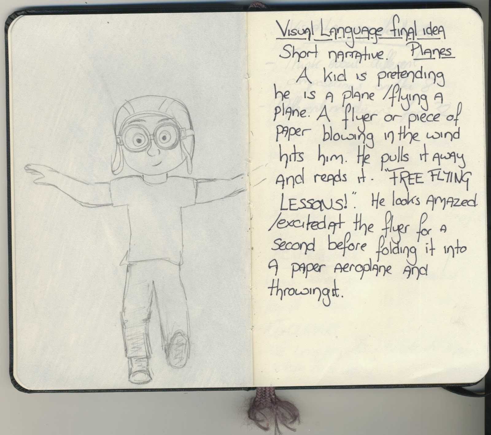
I intend to produce a short animated ident that is fun, exciting and uses bright, contrasting colours. It will use ideas and elements from some of the tv shows on itv2 and be in the style of the viral tap logo. I will use images that represent a selection of programs aimed at the intended audience from itv2 and animate them to move smoothly and fluidly from one to another, while being fun and interesting.
The content will focus on fast-paced movement similar to the celebrity juice opening credits style movements, and images to represent individual programs in a pop-art style.

The problems I aim to solve are that not enough young people are watching itv2, because they perhaps don't know that it's been rebranded. Itv2 want viewers of all ages, mostly focussing on the younger generation, but they would want viewers of all ages to boost ratings.
In order to solve these problems I will create a fun and exciting short ident that advertises the channel and draws in the younger generation. I will included elements from a variety of programs in order to advertise the different programs on the channel to a wider audience and create it in a pop art style that is interesting to the intended audience, using bright colours but not childish colours.


Monday, 10 March 2014

Sketchbook.


I did a quick sketch of a figure in my sketchbook. This has helped me work out proportions in the female form.

Tuesday, 29 October 2013

Set, Series, Sequence Development.

My word for Set, Series, Sequence was plane. I started by drawing my 32 images to do with plane. My favourites were the kid playing that he was a plane (Like the carl from Up) and the paper plane. I then took these to my 8 drawings, looking at viewpoints and media.

I made some notes in my sketchbook when I thought of ideas to draw..


And finally I came up with my final idea for my sequence of 12.


About Me

My photo
I'm Becky, although I do also answer to my surname- Gilby. I am a 22 year old Animation student at Leeds College of Art, specialising in Stop Motion Animation and Puppet making. I hope to make it into the stop motion industry making puppets.